Styling
Global Styling
The global colors of your application (primary and content colors, generated shades, light and dark theme) are set by your design system plugin. With Ferris Wheel, open its button in the top bar to edit its palette. Nuxt UI has its own color settings.
Reusable values shared across your components are tokens.
Element Styling
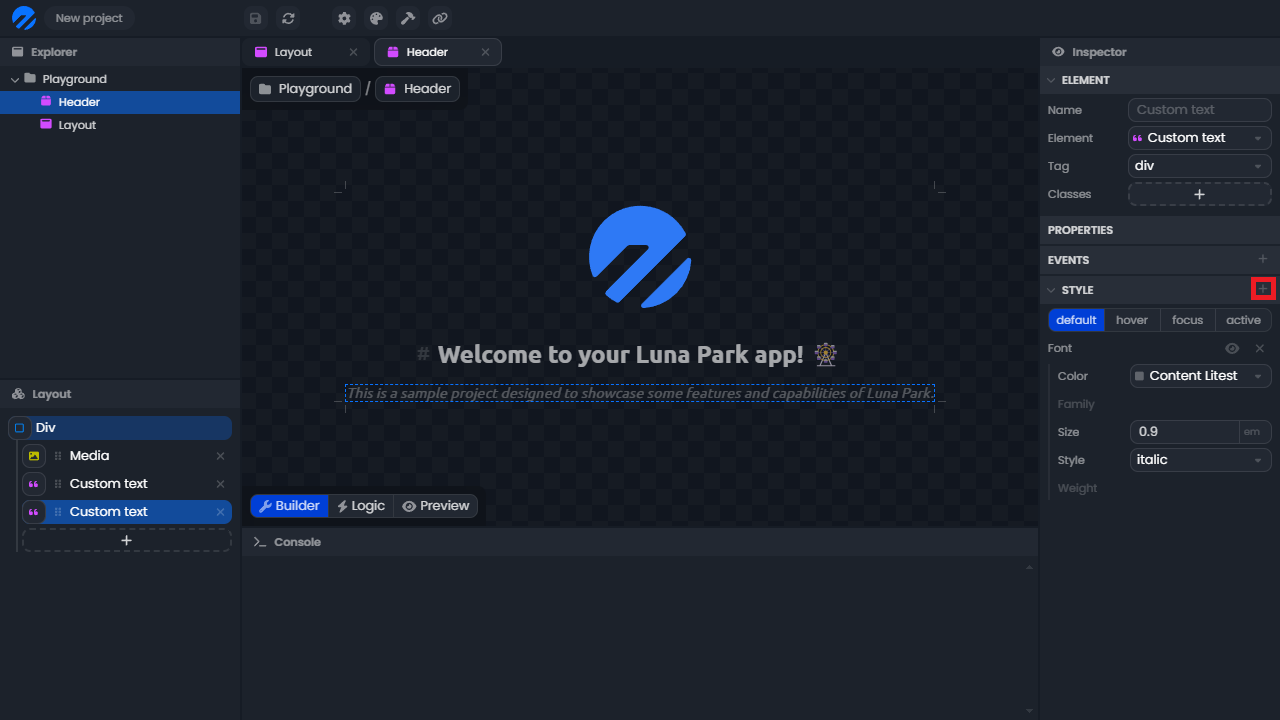
Each element of your project can be styled individually in the inspector, under the style tab. This lets you customize the appearance of each component of your application, such as text, images, or buttons.
To add a style category (e.g., color, typography, size), simply click the + button in the style tab. You can enable or disable each property by clicking on its name.
Some properties accept two values, such as translation (X/Y) or spacing (horizontal/vertical). Luna Park then displays two input fields, each with its unit menu, editable independently.
Note: All styling rules available in Luna Park correspond to the CSS rules found in web standards.
Quick style panels
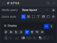
For common edits, some style categories are accessible directly from the layout builder, without going through the inspector's style tab. Select an element to bring up the quick style panels (border, background, size, spacing, text, shadow, etc.).
Design Tokens
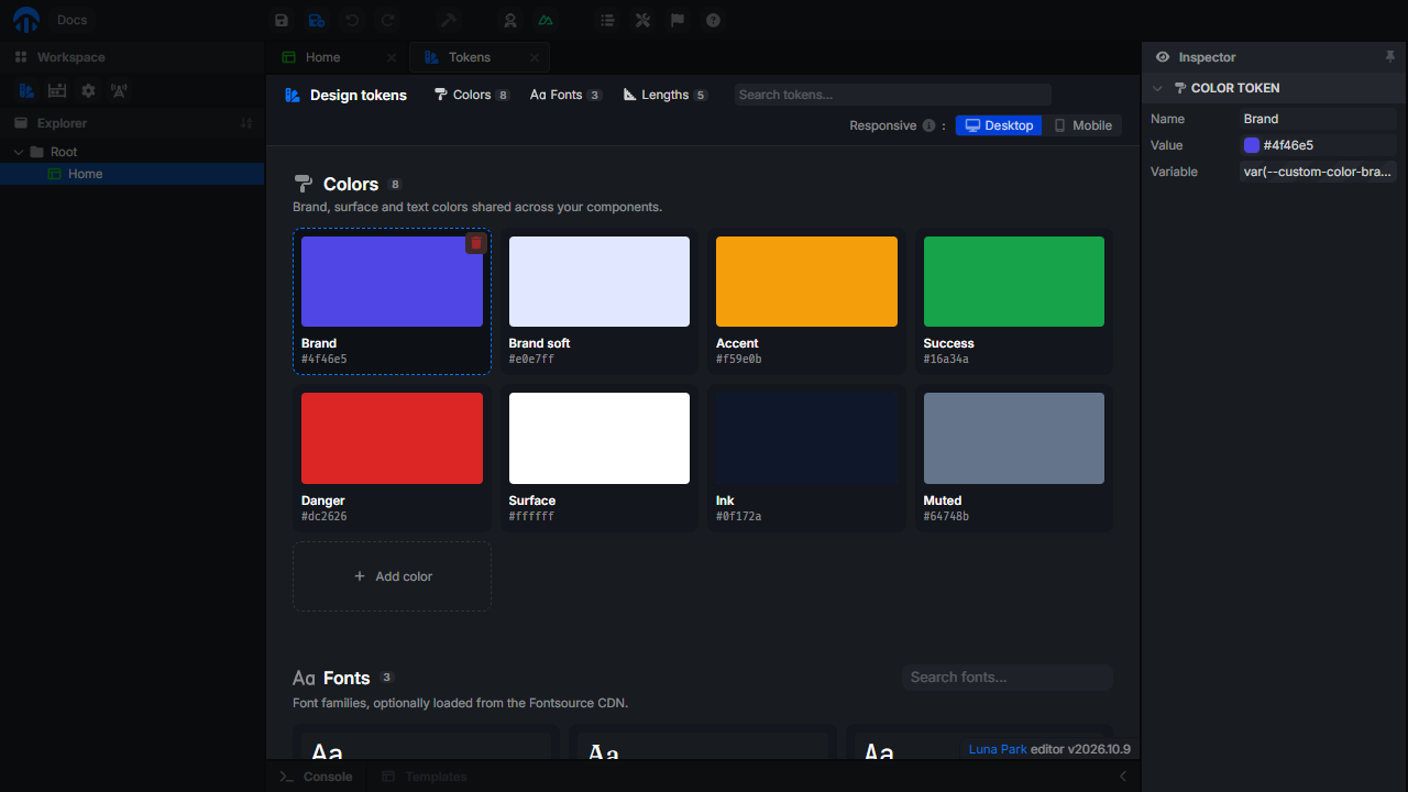
Luna Park also allows the use of design tokens. These are reusable values that ensure a consistent style throughout the application. For example, you can define a primary color and use it everywhere in your application. This makes style management easier and allows for quick global changes. Manage them in the Tokens workspace, see Tokens.
To use a design token:
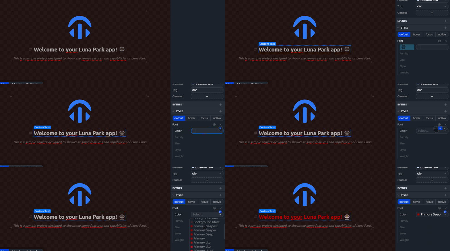
- Hover over the value you want to change.
- Click the link icon to switch to design token selection mode.
- Select the design token you want to use.
Style Variables
You can also use variables to style your components. These variables can be used in the style properties of your components. This lets you create dynamic styles that change based on the state of your application.
To use a variable in a property of your component:
- Hover over the value you want to link to a variable.
- Click the lightning icon to switch to variable selection mode.
- Select the variable you want to use.
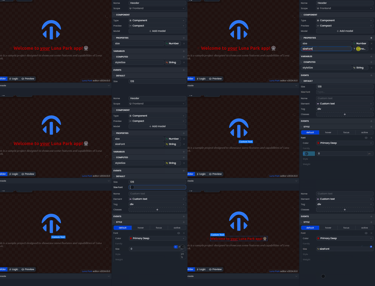
Note: Only variables matching the expected type for this property will be available in the list. For example, a numeric variable will only appear for a property expected to be a number.