Builder
Builder mode is where you build the interface of a page or component. Open a page or component file, and pick Builder in the mode selector under the main view.
In Builder mode:
- the main view shows the canvas, a live rendering of the layout;
- the options panel (bottom left) shows the layout tree, the list of elements;
- the inspector (right) shows the panels of the selected element: Element, Properties, Rendering, Events, and Style.
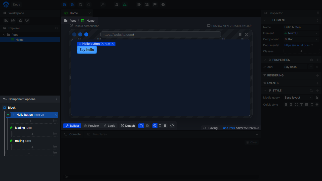
The layout tree
The layout tree mirrors the canvas: each line is an element, and indented lines are its children. The root element at the top is the component itself.
Clicka line (or the element on the canvas) to select it and show its panels in the inspector.Double-clicka line to collapse or expand its children.- Drag a line by its grip to move it before, after, or inside another element. On the canvas, hold
Ctrlto drag elements quickly. Ctrl + X/Ctrl + C/Ctrl + Vcut, copy, and paste elements,Deldeletes them.
The icon at the start of each line is the element type. Click it to change the type of an existing element.
Inserting elements
There are three ways to add an element.
From the layout tree
Under the children of each element, the layout tree shows two buttons:
- + adds an empty Block at the end;
- the list button opens the element list: pick a type to add it at the end.
With the context menu
Right-click an element in the tree to Create before, Create after, or Create inside it. The new element is a Block; change its type from the Element panel of the inspector.
The same menu can Wrap in component (turn the selection into a new component file), Unwrap and delete (remove an element but keep its children), and copy or paste a style.
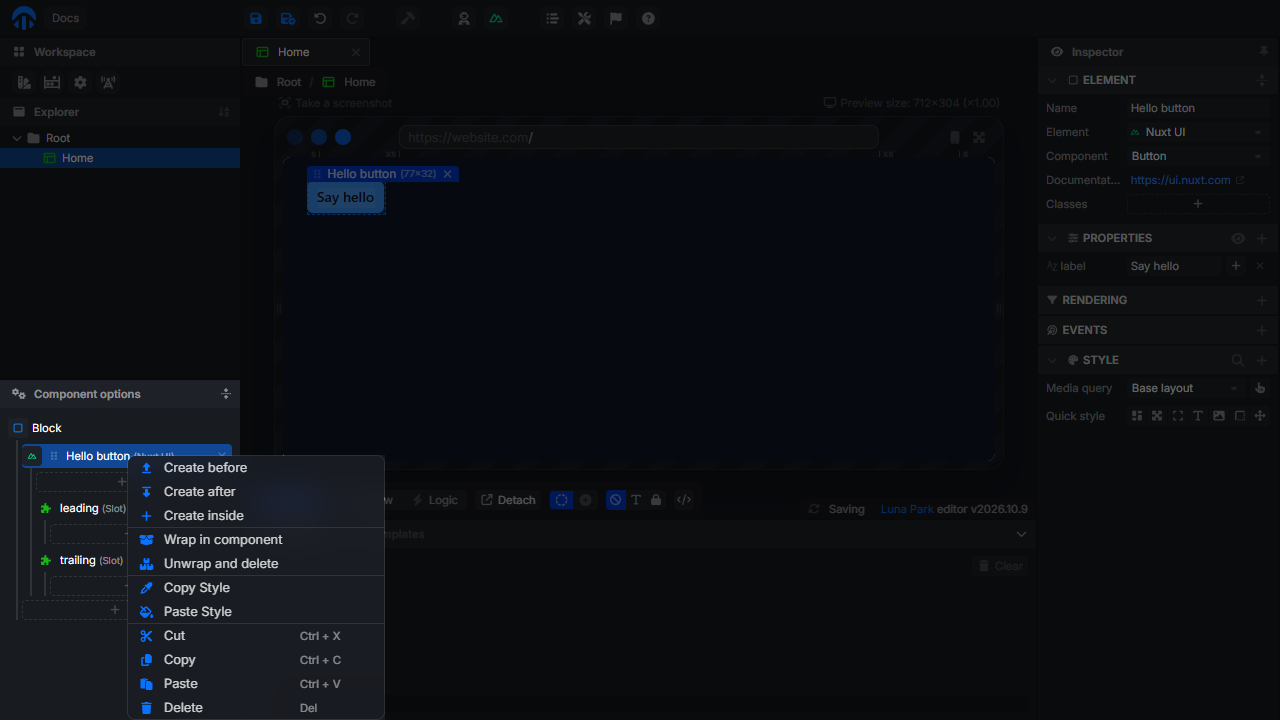
With insert mode
Toggle Show insert mode in the toolbar under the main view. Insertion points appear around and inside the elements of the canvas. Click one to open the element list and insert the element right there.
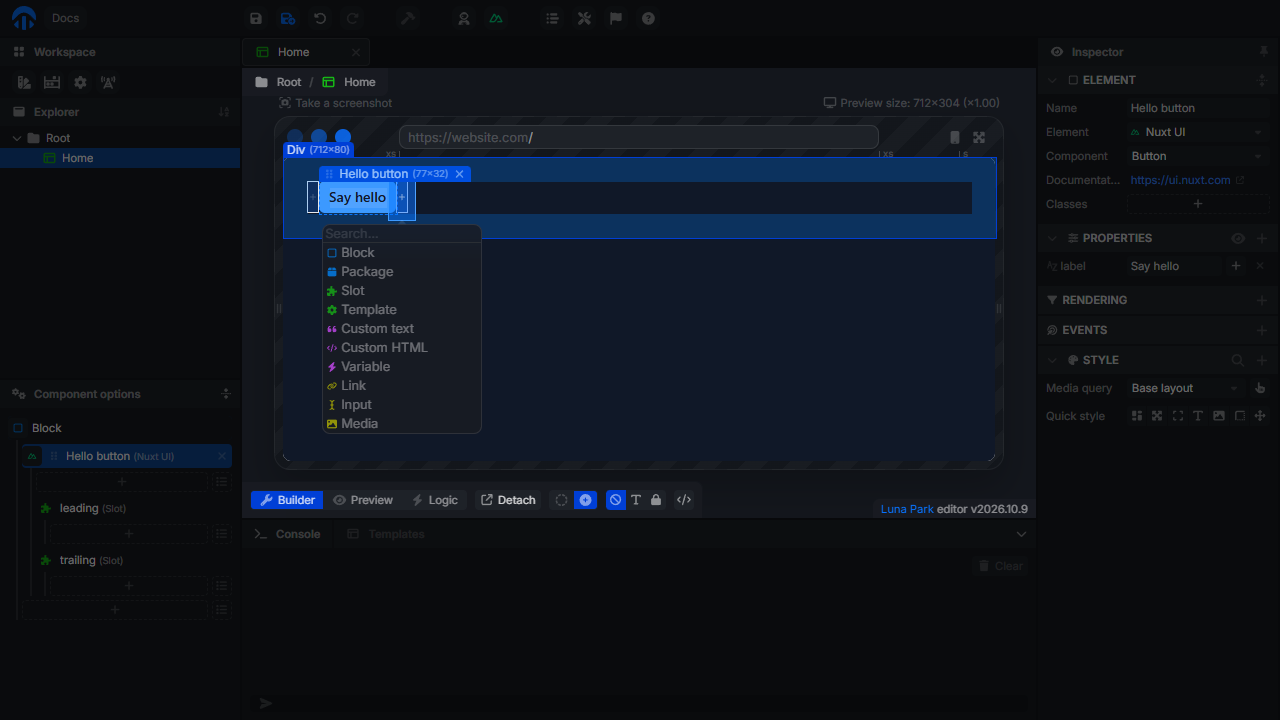
The element list
| Element | Description |
|---|---|
| Block | A container that can have children. Pick its HTML Tag in the Element panel: div, section, header, nav, form, button, hr... |
| Package | A component provided by an installed npm package. |
| Slot | Where the children given to this component are displayed. See Components. |
| Template | Show content under a condition, or repeat it for each item of a list. See Conditions and Loops. |
| Custom text | Text written directly on the canvas, with variables. Pick its Tag: span, p, h1, h2, h3... |
| Custom HTML | Raw HTML code. |
| Variable | Display the value of a variable. |
| Link | A link to a page of your app or to a URL. |
| Input | A text field (input or textarea), with a type, a placeholder, and a value. |
| Media | An image, a video, or an audio file. |
| Component | One of the components of your project. Shown once the project has at least one component. |
Buttons
For a styled button, use a plugin component such as Nuxt UI > Element > Button, and set its label in the Properties panel. For a native button, use a Block with the button tag, with a Custom text inside it for the label.
Plugin components
Each installed plugin that provides components adds an entry named after the plugin (for example Nuxt UI) to the element list, next to Package. Open it to pick one of its components. Its options appear in the Properties panel of the inspector, and its own events in the Events panel. If the component has slots (like leading and trailing for a Nuxt UI Button), they are listed under it in the layout tree: add elements inside a slot to fill it.
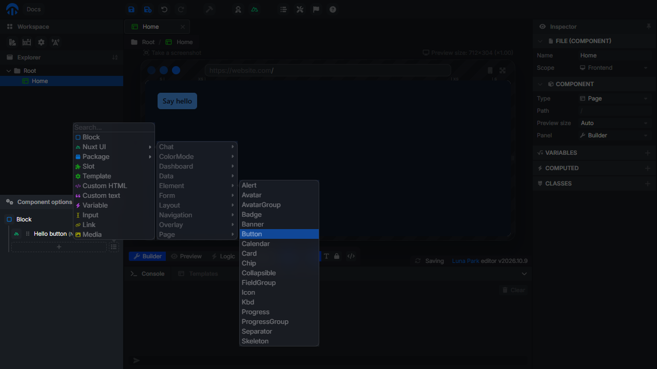
Prefer a plugin component when you want a styled, accessible widget (buttons, modals, selects, tables...). Prefer native elements when you want full control over the markup and the style.
Plugins can also provide templates: ready-made blocks listed in the Templates tab of the bottom panel. Drag one into the layout to use it.
Selecting an element
The inspector panels of the selected element:
| Panel | Content |
|---|---|
| Element | Name, type, HTML tag, and CSS classes. |
| Properties | Attributes of the element (or of the plugin component), static or bound to a variable. |
| Rendering | Show the element under a Condition, or repeat it with a Loop over a list. Simulation picks how it is shown in the editor. |
| Events | What happens when the user interacts with the element. See Events. |
| Style | Quick style, media queries, hover, and every CSS property. See Styling. |
Give important elements a Name: it is shown in the layout tree and in the name of their event nodes (On Click (Hello button)).
Where did my element go?
If an element is in the layout tree but not on the canvas:
- it, or one of its parents, may have a Condition that is false or a Loop over an empty list (in the Rendering panel, or on a Template). Set Simulation to
displayto see it while editing; - its parent may have no size (an empty Block with no padding);
- a style may hide it (
display: none,opacity: 0, outside of anoverflow: hiddenparent); - a media query may change its style at the current preview size.