Tokens and Style Variables
Tokens are reusable values that define the visual foundations of your application: colors, fonts, and lengths (spacing, radius, sizes). They ensure style consistency and allow you to modify the global appearance without having to edit each component individually.
For example, if you modify the Brand color token, all areas using it will be updated instantly.
The Tokens workspace
Click Tokens in the Workspace to open the tokens of your project. They are grouped in three sections: Colors, Fonts, and Lengths. The toolbar jumps to a section, and the search field filters the tokens by name or value.
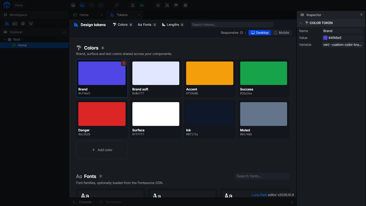
- Click Add color, Add font, or Add length to create a token.
- Click a token to edit its Name and Value in the inspector. The Variable field gives its CSS variable, to use it in custom CSS.
- Drag a token to reorder it.
- Hover a token and click its trash icon to delete it (hold
Ctrlto skip the confirmation).
Fonts
Use the Search fonts... field of the Fonts section to add a font from Fontsource, filtered by category (Sans, Serif, Mono, Display, Handwriting). The font is loaded from the Fontsource CDN, in the editor and in your app.
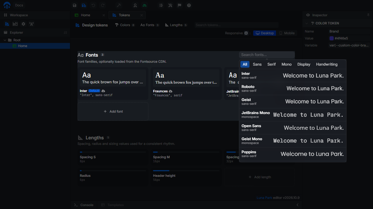
In the inspector, a font token has two more options:
| Option | Description |
|---|---|
| Fontsource | Load the font stylesheet from the Fontsource CDN. Uncheck it for a font that is already available (system font, or loaded with code injection). |
| Default | Apply this font to the whole application. Only one font can be the default. |
Responsive strategy
The Responsive option of the toolbar sets the direction of the media queries applied in your styles: Desktop (desktop first) or Mobile (mobile first).
For a breakpoint set at 1024px:
- Mobile first: the rule applies to screens ≥ 1024.
- Desktop first: the rule applies to screens ≤ 1024.
Using a Design Token
- Hover over the value you want to modify.
- Click the icon to activate token selection mode.
- Select the design token you want to use.
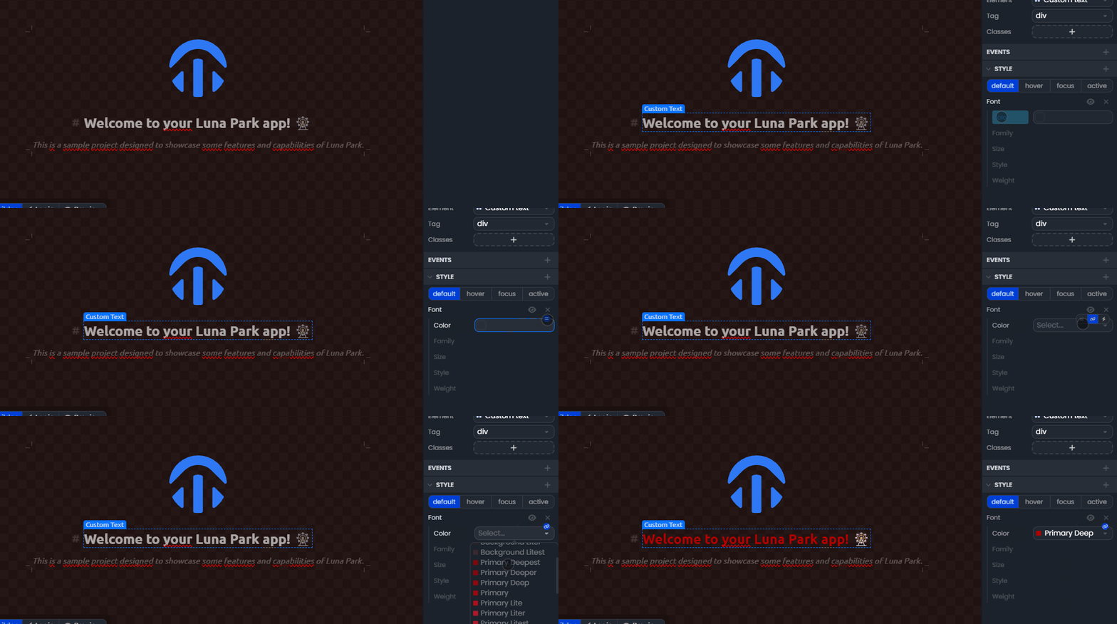
Note: Tokens replace hardcoded values and serve as a basis for global style customization. Plugins can add their own tokens.
Style Variables
Style variables allow you to make your components dynamic: a color, size, or property can change based on the state or data of your application.
Unlike tokens, which are static and global, variables are contextual and reactive. They are used to visually adapt components according to your application logic (e.g., if loggedIn = true, then color = success-color).
Using a Style Variable
- Hover over the value you want to link to a variable.
- Click the icon to switch to variable selection mode.
- Select the variable you want to use.
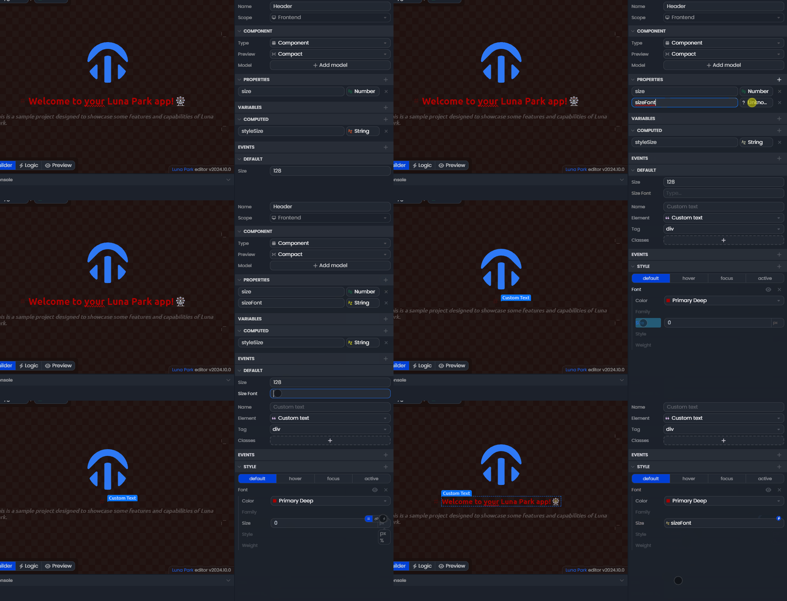
Note: Only variables compatible with the property type will appear in the list. For example, a numeric variable will only be available for a number type property.